
A wee while ago I signed one of those Change.org petitions in support of models who are being asked to starve themselves in the hope of being given a modelling job. I believe the petition was started by a young woman who was told that she wasn’t thin enough at size 8 (UK) they wanted her right down to the bone.
Every now and again I get updates as to how the petition is doing and about MPs and such who have taken an interest in the subject. I had been under the impression that the fashion industry was beginning to be a bit more responsible and humane. So it was with a huge shock and revulsion that I noticed the current issue of the fashion magazine Porter, while I was standing at a supermarket check out. It’s no exaggeration to say that I’ve seen healthier looking people on their death beds. The actual magazine cover looks worse than it does in the image below, the model’s skin is grey and she looks totally emaciated, she looks like she is too weak to focus her eyes, I believe the look used to be called heroin chic, but I just had a huge urge to track the model down and try to talk some sense into her, no career is worth looking like a concentration camp victim. I hope that for some odd reason she has had a horrific make-up job done on her.
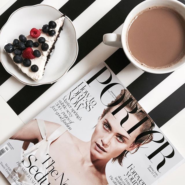
I believe that Porter is a fairly new glossy magazine and it prides itself on being – the fashion magazine for the stylish, intelligent woman of now.
So it seems bizarre that such an unattractive image was chosen for the front cover. I’ve had a look back at some previous covers and there has been nothing as bad as the one above, in fact the models are usually quite attractive and healthy looking. Hopefully this cover is just an aberration, or maybe it’s two fingers up to the people who are trying to get model agencies to change their evil ways.
I really think that it’s about time that magazine distributors told editors that they will not deal with covers that show stick thin models who look like death. Supermarkets shouldn’t be putting such images in front of their customers either. If I had a young daughter I’d hate her to think that that was a look she should emulate.
Susie Orbach said that – fat was a feminist issue, surely thin is too!
That is very interesting, I saw some other photos and she did not look nearly so bad. So why pick that one for the cover?
tracybham,
It’s a mystery. It’s the sort of photo that most people would want to destroy if it was of themselves. I can’t imagine anyone would be drawn to buy the magazine with a cover like that.
I think back to the mainstream ideas of beauty I grew up with: we aspired to look healthy, intelligent, poised, well-off. A curious world now where models frequently look ill, vacant or surly, graceless and poverty-stricken.
Good on you for signing that petition.
Valerie,
I know that ideas of beauty do change over the years, in the past Rubenesque was fashionable, then in the 1960s skinny was the thing to aim for but I don’t remember Twiggy ever looking ill. Those stomping lines of scowling scarecrows at fashion shows are very off-putting, to me anyway.
She looks like a zombie. A hungry zombie. Not good!
Christy,
I was going to say she looked like a zombie but I wasn’t absolutely sure, having never really seen any such films, just random clips. It’s very strange, whatever!
I think she gives a rather good impression of Boris Karloff. Maybe the photo was chosen because the model’s gaze is repellent in a way that forces the viewer to stop and take a second, longer look rather than just a passing glance. Interesting, but “not up my alley.”
Judith
Judith,
I did take a second and third look because I couldn’t believe what I was seeing, but then I turned my back on it – and it still gave me the creeps! I can’t imagine it would make anyone buy the magazine.